Attention is fragile on phones. People open, skim, and bounce. Smart apps counter with quiet mechanics that slow exits by giving the thumb a reason to keep moving. Not tricks. Just tiny, well-timed prompts that feel natural.
1) Contextual UI nudges
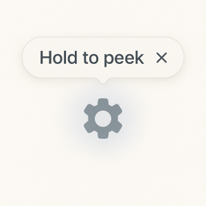
Nudges are micro-signals that say “one more tap” at the exact moment you’d quit.
-
Soft highlights that appear only when a control becomes useful.
-
One-line hints that fade after the first success.
-
Micro-pulls: a card peeks up a few pixels at the bottom edge, suggesting there’s more below.
Build notes
-
Triggered by intent, not time. Nudge when the user stalls for ~600–900 ms on a critical screen.
-
Keep copy to 4–7 words. Example: “Swipe to compare”, “Hold to peek”.
-
Decay aggressively: 1–3 views max, then retire.
2) Micro-interactions that reward action
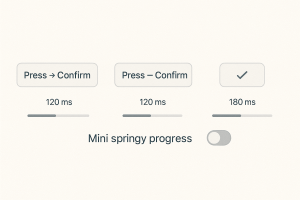
Small animations confirm progress and create rhythm. The loop is simple: act → see response → act again.
-
Button press shrink/restore in <120 ms.
-
“Success ticks” that animate in a single frame at 60–120 ms.
-
Haptic taps on key thresholds (iOS: light impact; Android: haptic feedback enabled only once per flow).
Build notes
-
Duration budget: 100–200 ms for confirmations; 250–350 ms for transitions.
-
Ease curves: standard ease-out for confirmations; spring/light bounce for celebratory unlocks.
-
Respect Reduced Motion settings. Always provide a non-motion fallback.
3) Gamified Micro-Feeds
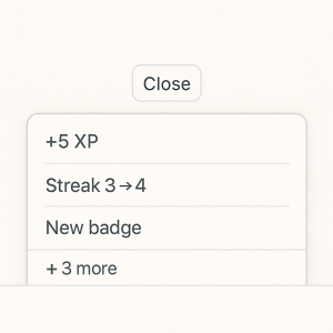
A micro-feed is a tiny, self-updating stream tucked into dead zones: empty states, receipt screens, or post-task pauses. It shows bite-size wins that stack without noise.
-
+XP ticks for small actions.
-
“Streak 2→3” chips that animate inline.
-
Micro-badges that slot into a horizontal carousel you can ignore—or open when curious.
Build notes
-
Update cadence: every 2–5 seconds while the user is idle, then stop.
-
Cap display to 3–5 items; older chips collapse into a “+N more” pill.
-
Never block navigation. Feed lives below the fold or in a collapsible drawer.
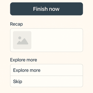
4) Exit-delay engineering (without dark patterns)
The goal: give a fast, honest branch that still slows the bounce by a beat.
-
“One-tap finish” at the top, “Explore more” at the bottom. Reversed from typical layouts so the exit path stays visible.
-
Post-completion choice: “Share / Save / Try another”. The second and third keep session momentum without feeling like a detour.
-
Gentle “last look” states: a recap card that’s scrollable for 1–2 more screens.
Build notes
-
Time the recap to load instantly from cache; prefetch thumbnails.
-
Add a thumb-reachable secondary action at ~64–72 px above the bottom edge.
-
Rule of three: never show more than three alternative paths on an exit screen.
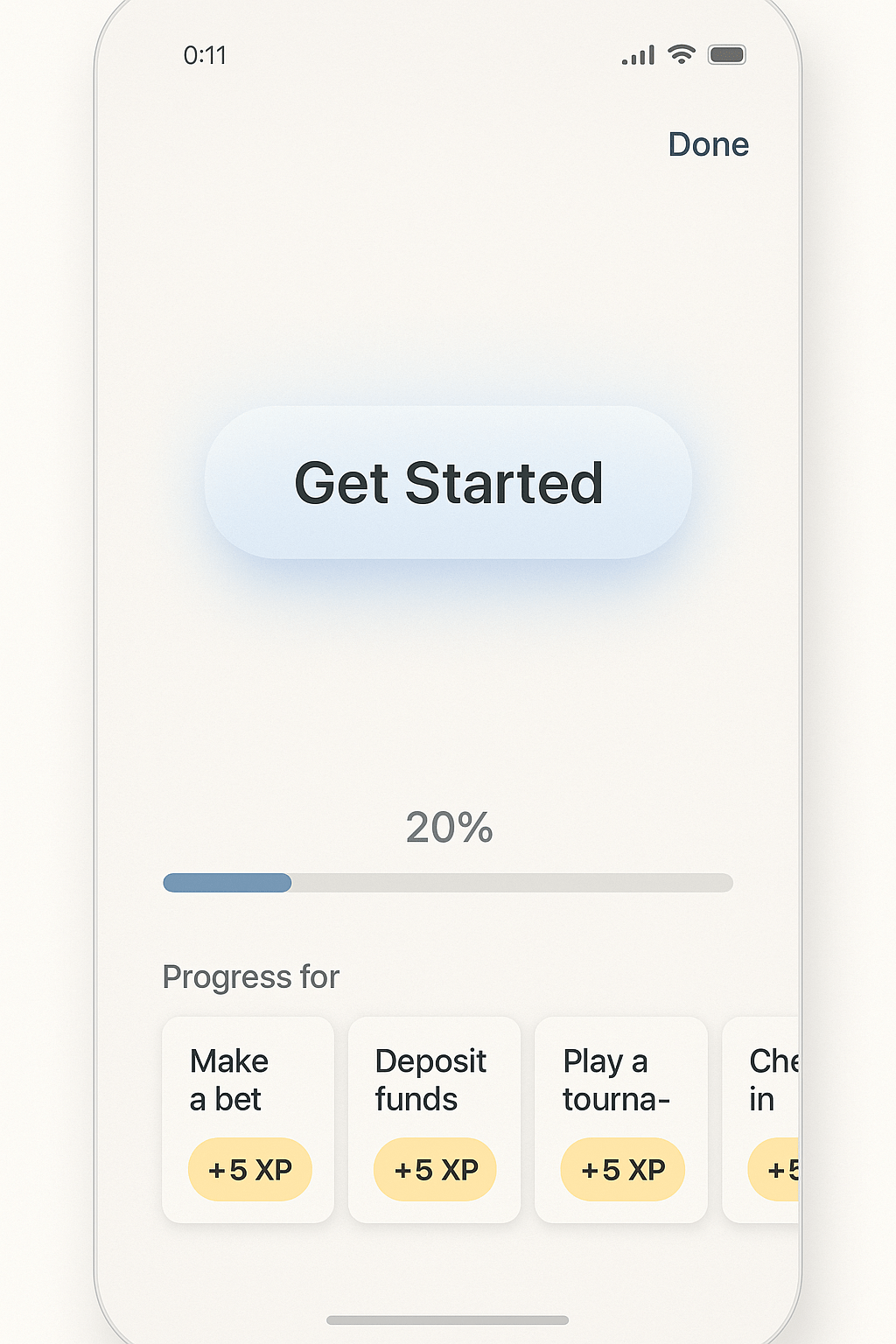
5) Progress scaffolding that starts at zero
Show forward motion even when the user has barely started.
-
Seed bars at 20% on first entry with a label like “Profile basics done”.
-
Break long tasks into 3 mini-steps with visible checkpoints (1/3, 2/3, 3/3).
-
Put a tiny “next” affordance inside the completion toast so the user flows into the next step.
Build notes
-
Seeded progress must be truthful. Count what the app already knows.
-
Place the stepper close to the primary button; avoid eye travel.
-
Auto-advance to the next step after 600–800 ms unless the user taps “Done”.
6) Rhythm via motion and dwell
Motion directs attention; dwell absorbs micro-pauses.
-
Morphing controls (icon→label) teach function without text walls.
-
Sticky bottom sheets that rise 20–24 px when the timeline hits a known boredom zone.
-
Skeleton screens that resolve top-to-bottom in under 400 ms to signal life, not lag.
Build notes
-
Keep frame budgets tight; target 16 ms per frame.
-
Animate property changes (opacity, transform) not layout where possible.
-
Use content-first skeletons that hint at structure (avatar, title, meta line).
7) Guardrails against manipulation
Nudges should guide, not trap.
-
Always display a visible close or “Skip for now”.
-
Default copy to neutral language. No urgency bait.
-
Cap repetition. If a nudge fails twice, retire it.
Build notes
-
Log opt-outs and suppress across the session.
-
Respect system accessibility: larger text, reduced motion, color-contrast ratios.
Quick checklist
-
Intent-triggered nudges only
-
Confirmations under 200 ms
-
Micro-feed capped and collapsible
-
Exit path always visible
-
Seeded but truthful progress
-
Motion that teaches, not decorates
-
Ethical defaults and hard caps